An article recently published on BIG Media (Assessing the relative lethality of COVID-19: a Canadian case study), presented an analysis of all causes of death in Alberta from 2001 through 2019, and compared the COVID-attributed deaths of 2020 to the overall “deathscape”. At the time I was researching and writing that piece, I noticed an article on the CTV News website[1] addressing a similar theme. This article was based on the same source of data I was using,[2] however it was presenting the data and comparative causes of death in what I consider a misleading manner.
The chart from the article (reproduced below) supports the author’s alarming first sentence, “COVID-19 killed more Albertans over the past 11 months than any cause of death in 2019, excluding only dementia and heart disease, according to the province’s data.” A quick inspection of this chart shows that the causes of death in 2019 were divided into multiple subcategories, which has the effect of decreasing the number of each of the “normal” causes of death relative to the COVID number.
For example, “heart disease” is shown as nearly equivalent to COVID deaths, but causes of death labelled heart attacks, atherosclerosis, and congestive heart failure (all technically heart disease) are plotted in separate categories. Also, every type of cancer is given its own class, and only one specific type of suicide (by strangulation/suffocation) and one specific accident type (drug and substance poisoning) is shown. Obviously, the more fragmented the other causes of death, the worse the COVID numbers appear in comparison.
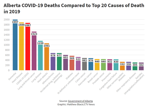
The author did not deliberately do this subcategorization; this is exactly how the data comes from the Alberta database, which contains over 350 categories of death. Given this relatively messy starting point, a key component of proper statistical analysis is “cleaning” and sorting the data so that meaningful interpretations are possible.
In order to get the most out of data, one must be a detective; cross-checking clues, validating evidence, being skeptical of appearances, and looking beyond face value. The true story is often buried in the data, not obvious on the surface.
If it is our objective to understand rather than shock, we learn a lot more from data by doing some of this detective work. Grouping the causes of death into appropriate categories is a start. A revised presentation of COVID deaths relative to the – now more appropriately grouped – top 20 causes of death in Alberta in 2019 is shown in Chart 2. COVID-19 is the fourth-leading cause of death in this picture; the leading three represent more than eight times the total number of COVID deaths, which is slightly higher than those caused by accidents.
This chart uses the same other assumptions as the CTV chart, namely: all age groups and genders grouped together, and no corrections for population differences between 2020 and 2019. The discrepancy between the slightly higher COVID death numbers shown here and the CTV numbers is due to the dates the data was accessed (we downloaded the data about a month after CTV, resulting in 12 months of COVID death data versus the 11 months referenced in the CTV article).
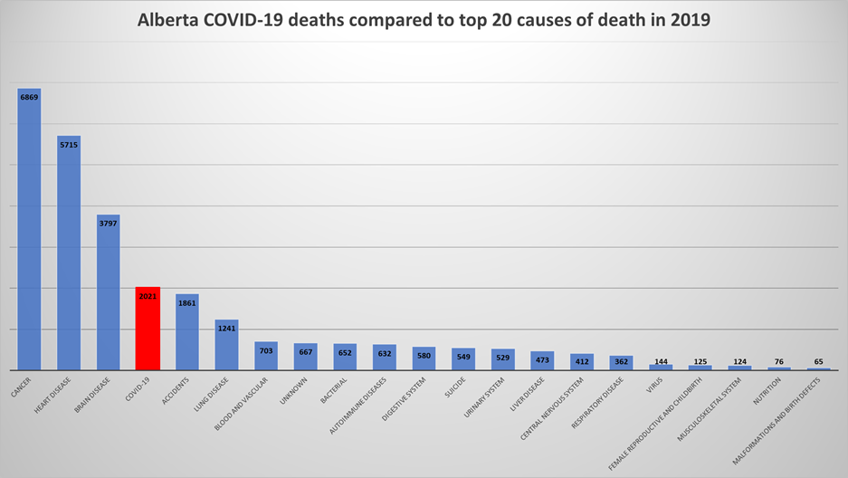
Chart 2: Alberta COVID-19 deaths (March 2020 to March 2021), compared with the top 20 causes of death in 2019.
This is only the beginning of a meaningful data analysis. The Alberta database provides gender (male and female) and age categories for each death. In order to compare each age group equitably, we have calculated population rates (number of deaths per 100,000). Separating the chart into these gender and age categories by population rate provides much more insight than an overview chart. Chart 3 shows the top 10 causes of death (now that they are grouped, 10 is sufficient) in 2019 compared to COVID-19 in 2020 for the female population, per 100,000. Chart 4 shows males. Click the tabs to show each age group separately.
Chart 3: Alberta COVID-19 deaths (March 2020 to March 2021), compared with the top 10 causes of death in 2019, for the female population per 100,000. Click on the separate tabs to see the totals and ranking for each age group.
Chart 4: Alberta COVID-19 deaths (March 2020 to March 2021), compared with the top 10 causes of death in 2019, for the male population per 100,000. Click on the separate tabs to see the totals and ranking for each age group.
It is revealing to spend a little time reviewing these gender- and age-specific causes of death. A few highlights:
- There were no deaths attributed to COVID younger than the 20-29 age group for either gender.
- In the 20-29 male age group, there was only 1 (per 100,000) COVID death, compared to 5 homicides, 24 suicides, and 44 accidents.
- While COVID deaths increase with age, particularly above 60, so do most other causes of death, such as cancer, heart disease, and brain disease. In fact, age may not be the defining factor in COVID deaths. Comorbidities, which generally increase with age, could be the principal causes underlying COVID-19 death rates (for more analysis on this subject, see BIG Media article COVID context – how concerned should we be with dying from this virus?).
Specific disease comparisons with COVID-19
CTV goes on to compare COVID-19 deaths to strokes (citing three times as many COVID deaths), breast or prostate cancer (four times as many), Alzheimer’s (five times), kidney failure (seven times), and Parkinson’s (eight times). Aside from the fact that the numbers have not been corrected for population variations between years, these statements are missing important context. (Incidentally, the author mistakenly calls these factors “orders of magnitude”, which is a mathematical term meaning by a factor of 10.)[3] Taken out of context, statements like this are an oversimplification of the real situation. Specific diseases all have different age and gender profiles that are important to understand before making sweeping comparisons.
For example, breast cancer almost exclusively affects women,[4] and prostate cancer affects only men. Therefore, we should compare COVID deaths to these cancers in males and females separately. This separation is shown in Chart 5, and we see a different conclusion: on the face of it, COVID was indeed responsible for more deaths than these two specific cancers, but certainly not by four times as quoted in the article.
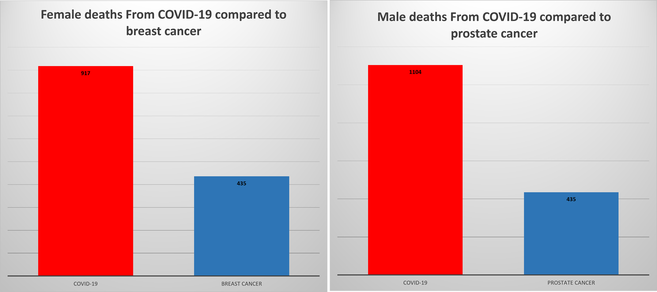
Chart 5: Total deaths from breast cancer (in women) and prostate cancer (in men) in 2019, compared with COVID-19 for each gender. All ages are grouped together.
Digging a little deeper by correcting for population and looking at the age distribution of deaths from these two gender-specific diseases, we see that there is more to the story. Chart 6 illustrates the relative death rates between COVID-19 and breast cancer for women in each 10-year age group. Chart 7 shows a similar graph for men and prostate cancer.
The only age groups where COVID deaths overtook breast cancer deaths in women was 70 and above, with significant impact in the over-80s. In men, COVID deaths in each age group were higher than those from prostate cancer. The vast majority of deaths from both diseases occur in the advanced age groups.
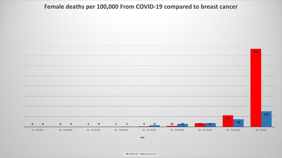
Chart 6: Breast cancer deaths in women in 2019 compared to COVID-19 deaths in women in 2020. Values represent number of deaths per 100,000 population.
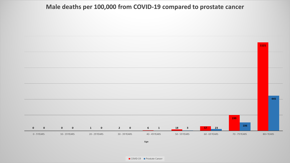
Chart 7: Prostate cancer deaths in men in 2019 compared to COVID-19 deaths in men in 2020. Values represent number of deaths per 100,000 population.
It is clear from this comprehensive analysis of the data that the real story is far more complex and nuanced than an alarming headline.
I do not want to single out a particular journalist for criticism, because the assertions in his article represent a misunderstanding and misuse of statistics common in media reports. Other points in the article may be valid. However, the incomplete data presentation obscures the true picture and compromises the credibility of the story. These shortcomings could be due to lack of statistical knowledge or a deliberate choice of data and comparisons intended to sensationalize and alarm. The latter attracts more readers, which sells more advertising (just saying).
Since most of the general public does not have the training to understand or critique statistical presentations, the most alarming conclusions get spread widely on social media, perpetuating misinformation and influencing people’s emotional responses and actions.
The COVID-19 pandemic is serious enough as it is without misrepresenting the data. Appropriate community action needs to be taken based on a detailed understanding of the facts, not an emotional response to superficial and often misleading statistics.
[1] How do Alberta’s COVID-19 fatalities compare with other causes of deaths? | CTV News
[2] https://open.alberta.ca/opendata/alberta-annual-deaths-totals
[3] One order of magnitude is 10 times as much; two orders of magnitude is 100 times as much, three orders of magnitude is 1000 times, and so on.
[4] Breast cancer can also affect men, although out of the nearly 8,000 Albertans who have died from breast cancer between 2001 and 2019, 78 (1%) have been men.
(Laurie Weston – BIG Media Ltd., 2021)


Thanks for this, Laurie!
You’re welcome, Jeff. Glad you appreciated the read.
Great synopsis Laurie! I believe that news agencies are pushing the “wow factor” in their reporting. This seems to have occurred sometime between 40 yrs ago, when I watched Knowlton Nash actually report the news, and today where we see constant sensationalized news reporting. I believe it is a shift coincident with the growth of the internet and news agencies are struggling to compete. Regardless, the majority of the population doesn’t critically think about what is being reported and I believe this is what is being exploited (on purpose) by modern reporting. Cheers!
Thanks Terry. Yes – for sure “news” reporting has changed considerably since the days of an impartial news-reader who doesn’t try to push an agenda or overly sensationalize for the sake of selling advertising. We can’t go backwards, but we can try to recognize and validate the truth.
Thanks for your great comments, Emily. It is definitely a matter of judgement to attribute a single cause of death when other factors are present. I have heard that they do sometimes list contributing factors on death certificates, but I don’t have data to show this – yet. The flu/COVID questions are all good points and something we will be addressing in future articles. It will be extremely interesting to see the 2020 data when available. In my charts in this article, influenza deaths were included in the virus category as you correctly assumed.
Great follow up to the original article and astute observations on the CTV report. Out of curiosity, when the AB statistics cite Covid as cause of death in the case of comorbidity, how does the coroner categorize the death? Eg an 80 year old man is dying of metastatic prostate cancer that’s gone to the bones with one month to live, then covid virus strikes…is his death attributed to covid or to cancer? For future analysis, understanding that data is not yet available for 2020, I believe you plan to consider common comments such as the common flu does not kill as many as covid…then one would question how were the common flu deaths separated from covid deaths? Was a covid test always administered or were all respiratory illnesses assumed to be covid? When we look at your charts, was the flu characterized as “virus” death, and if so, how do the deaths attributed to “virus” differ year over year to demonstrate some consistency of flu deaths in the years of Covid? What I’m getting at was whether or not the flu deaths were misattributed to covid for 2020. As you point out, data cleansing is important, as is understanding the error bars in the data inputs once cleansed. Really appreciate this work! Nicely done!